Documentation
In the package, you have :
- This manual
- The template
- The link for a free responsive slideshow
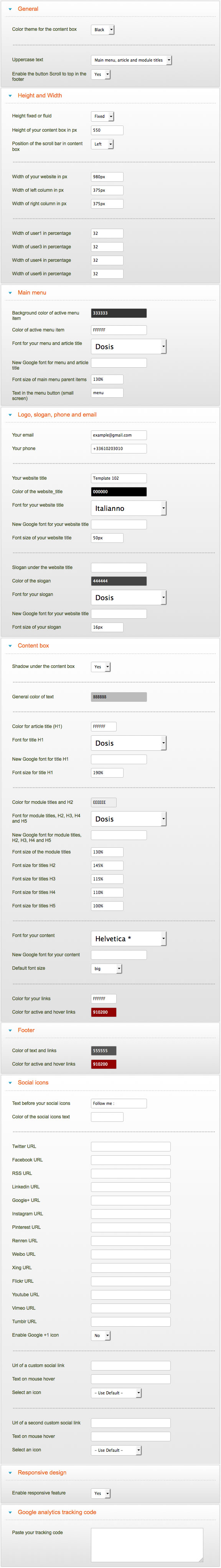
Template Settings
You can access to template manager with the top menu : "Extensions --> Template Manager --> joomspirit 102"
With "joomspirit 102" template, you can set a lot of parameters :
Typography
You can find a lot of possibilities to create a beautiful website. I explain all that in the demo :
- Click here to see the General typography : titles, alignment, drop cap, inset, background color, image, ...
- Click here to see the ordered and unordered lists.
- Click here to see the Column layouts.
- Click here to see the testimonials.
- Click here to see the tables.
- Click here to see the Font Awesome.
Font Awesome allows you to add vector icons from a library of over 360 to any part of your joomla template including Articles, Article titles, Menu items and Module titles.
Module Positions
In this example, I use the module position "right". You can use the position "left" if you prefer.
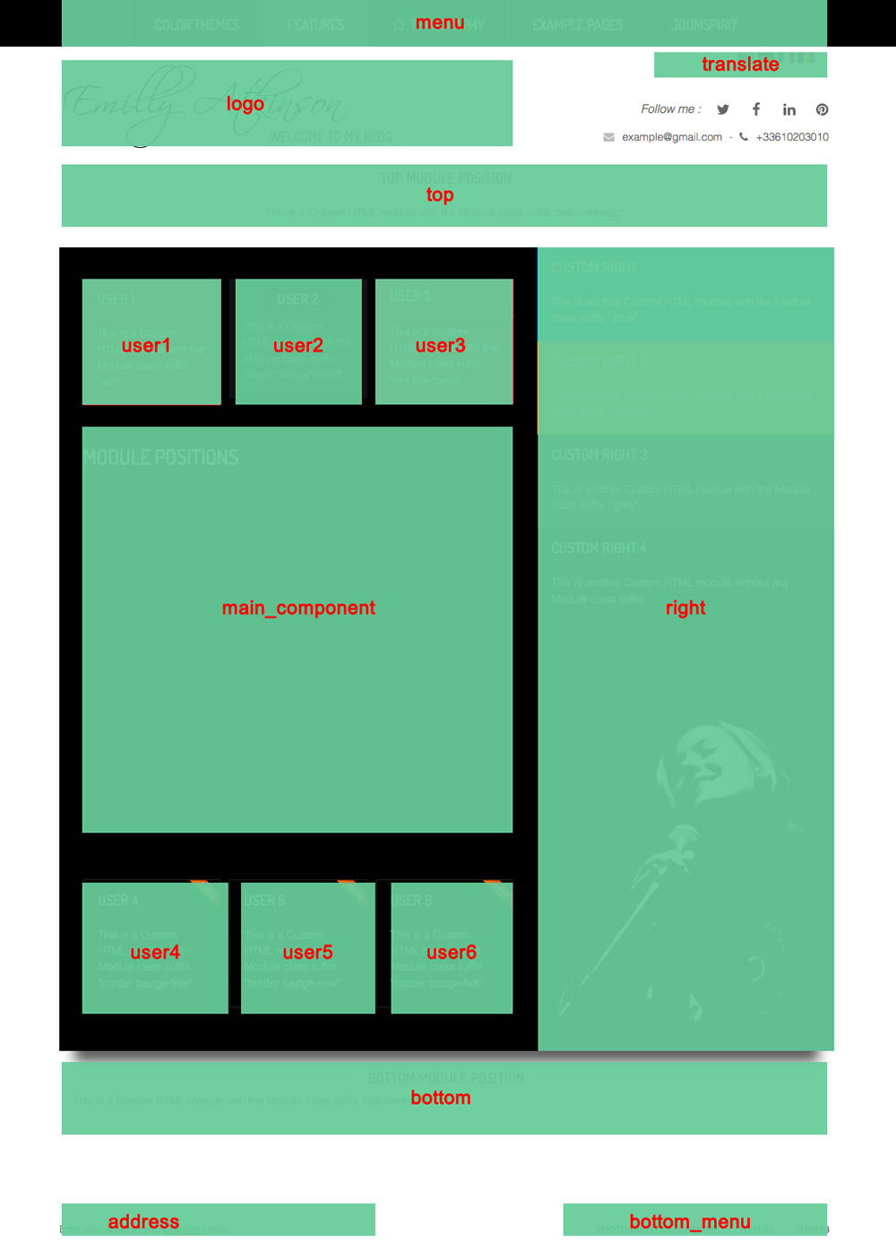
Example for the "address" position : go to the module manager and create a new module with the option "custom html". Write your address or/and copyright and choose the position "address".
How to display your logo ?
With this template, you choose if you want insert your logo or just write your site name and slogan (by default) :
- To change the site name, go to the Template manager and write your text (section "Logo, slogan, phone and email").
- To insert your logo, you must create a new module (option "custom html"), insert your logo inside (with the wysiwyg editor). Choose the position "logo" and publish it. The size of your logo is free.
Note : I include the image source of my logo in the package (for Fireworks). I use the free font Scriptina and Melbourne.
How to configure your menus ?
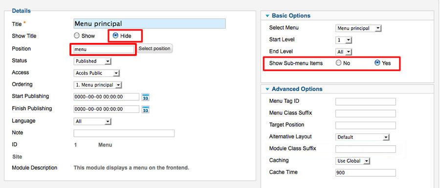
The dropdown menu (main menu):
To use it, you must select your main menu in module manager and enter these settings :
- position : "menu"
- Always show sub-menu items : "yes"
- No Module class suffix
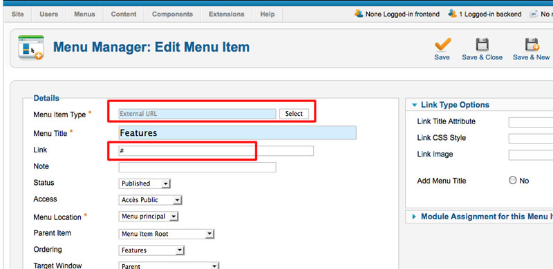
Note for mobile devices : the type of all parent items must be "external url" (don't use the type "text-separator"). Choose the type "external url" and enter the character # in the url field :
Additionnal horizontal and vertical menu
If you want display a second menu in the content part, you can choose almost 22 differents possibilities.
Click here to read all the details in the demo page with some examples.
Bottom menu
To use it, you must select your menu in module manager and enter these settings :
- position : "bottom_menu"
- Always show sub-menu items : "no"
- No Module class suffix
Note : you can use only 1 level of links with this menu.
Note : All these menus work without javascript code (pure CSS : no risk of conflict with another extension !).
Module class suffix :
Options for displaying your modules in the "left", "right" or "user" positions :
- Without module class suffix : No styling for your list and the links.
- With the module class suffix " horizontal_menu" : to display an additionnal menu. More details on the page "Display your menus".
- With the module class suffix " no-margin" : you remove the margin around your module. It's useful to display an image.
- With the module class suffix " border" : you add a border around your module.
- With the module class suffix " radius" : you add a rounded corner.
- With the module class suffix " shadow" : you add a shadow under the module (work only with White theme).
- With the module class suffix "white" : you add a white background
- With the module class suffix "black" : you add a black background
- With the module class suffix "grey" : you add a grey background (this color depend of the color theme)
- With the module class suffix "orange" : you add an orange background
- With the module class suffix "violet" : you add an violet background
- With the module class suffix "red" : you add a red background
- With the module class suffix "blue" : you add a blue background
- With the module class suffix "green" : you add a green background
- With the module class suffix "turquoise" : you add a turquoise background
- With the module class suffix "brown" : you add a brown background
- With the Module class suffix "title-centered" : the module title is centered with a line on each side (you can't put "title-band" in the same module)
- With the Module class suffix "text-centered" : the text and title are centered
- With the Module class suffix "title-band" : display a dark background under the module title (you can't put "title-centered" in the same module)
- With the module class suffix "badge-new", "badge-free", "badge-hot", "badge-top", "badge-news", "badge-gift" : to display a badge in the upper right corner of your module.
Note : If you choose a background color , the color of module title is always white.
Note : You can enter several Module class suffix. Example "shadow green badge-top title-centered"
Options for displaying your modules in the "top" or "bottom" positions :
- Without module class suffix : No styling for your list and the links.
- With the module class suffix " horizontal_menu" : to display an additionnal menu. More details on the page "Display your menus".
- With the Module class suffix "title-centered" : the module title is centered with a line on each side (you can't put "title-band" in the same module)
- With the Module class suffix "text-centered" : the text and title are centered
- With the module class suffix "badge-new", "badge-free", "badge-hot", "badge-top", "badge-news", "badge-gift" : to display a badge in the upper right corner of your module.
Special Module class suffix to display the image (or a slideshow) in "Left" or "Right" position :
Normally, you can use the Module class sufix "no-margin" to display an image in a Custom HTML module.
It's correct in a desktop format but the result isn't good in small device. So I create a new type of Module class suffix to center the image in small devices and specify a max width for the image (only in small devices).
This is the list of these Module class suffix :
- image200
- image250
- image300
- image350
- image400
- image450
- image500
In this demo, I use always the Module class suffix " image300" : in small devices, the image is centered and with a max width of 300 pixels. In desktop format, there is no margin around the image.
Extra Module class suffix for mobiles
For faster mobile-friendly development, use these utility classes for showing and hiding content by device. More details here
How to obtain the Home page of the demo ?
I publish an article (menu type = "single article")
I create a new module with the type Custom HTML. I choose the position "right" and insert an image with the wysiwyg editor. The size of this image is 375 * 550 pixels because in Template manager, the height of my website is 550 px and the width of right column is 375 px.
I added the Module class suffix "image300". It's important to remove the margin around this module and for the small resolution (image centered and with a max width of 300 pixels).
Is it possible to display a slideshow on the "Left" or "Right" column ?
Yes of course and I recommend you to use my free responsive slideshow.
Install the module and edit it :
- choose the position : "right" (or "left")
- and add a Module class suffix "imageXXX" , per example "image300"
Note : I recommend you to resize your images with the correct dimension. By default the height of your website is 550 px and the width of each column is 375 px.
Bootstrap
The template is build with Bootstrap 3.1.1.
Tips for the user modules
In the template manager, you can choose the width for user1 and user3. The width of user2 automatically adjusts.
So, if you publish only one user module : publish user2 (for a width of 100%).
If you publish two users module : publish user1 and user2, or user2 and user3.
It's the same thing for user4, user5 and user6
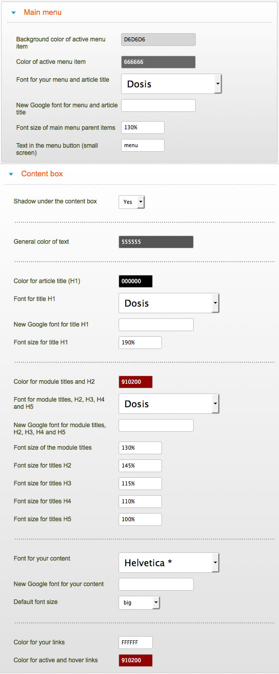
Settings for the White theme
You can see the White theme in action in the demo.
In template manager, I change the settings of Main menu and Content box. There are my settings :
How to add a new Google font in Template manager ?
- Go to the Google font page. Choose your font and click on the button "quick use"
- Paste the code below and copy it in Template manager.
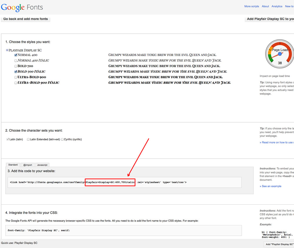
In this example the code is : Playfair+Display+SC:400,700italic
How to add an icon before a menu item or before an article title ?
Click here to see the details of Font Awesome.
Font Awesome allows you to add vector icons from a library of over 360 to any part of your joomla template including Articles, Article titles, Menu items and Module titles.
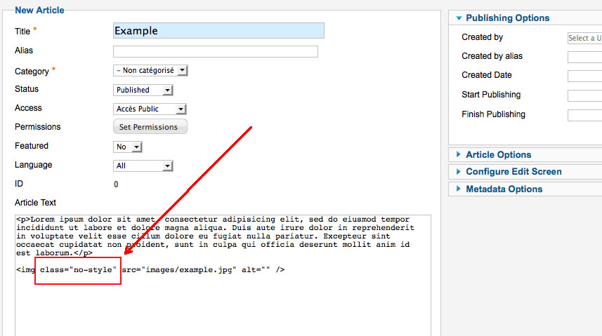
Tips for your images
By default, a border is added around all your images in your articles. You can disable this option in the section "General" of Template manager.
If you want add this border only on specific images, disable this option and add the class "js-border" in the HTML code of your image.
If you want remove this border only on specific images, enable this option and add the class "no-style" in the HTML code of your image.
Customize the template
You can put all your custom code in the file "css/custom.css".
Link
To continue to offer affordable prices, I decided to display a soft Copyright in the bottom right corner to increase awareness of the site JoomSpirit.
This does not affect your site, but if you want remove this link, you must edit the file "index.php" and delete the line 493 in the end :
<?php echo $js ; ?>